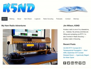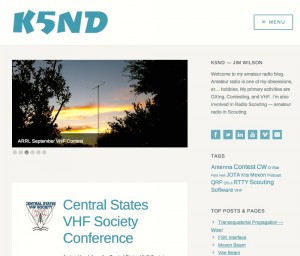
This past week I conducted a makeover on this website. I have always used (over the past 10 years) a static home page showing an image slider of my ham shack. This time I’ve taken an entirely new approach.
I found a WordPress theme that provides a button for the menu, which opens up at the right hand side of the webpage. I like that for this site as there are not a high number of pages. It is mostly a blog (with 193 entries now). Given that, I also configured the home page to show off those blog entires. The image slider shows the most recent six blog entries followed by a list of the earlier posts. I feel that this works well for this type of website.

At the right are before and after images of the home page. It’s still a very clean look with a slight change in color scheme. I decided to follow the existing theme’s primary color and then updated the logo and social media icons to match. The logo continues my use of the version I created from modifying a Dry Cut font version.
I’ve also got this thing for social media icons. I created these in Photoshop, originally for my PathForeWord website. For these, I modified the color and style. I also created the email icon from scratch.
I hope you like the new website. I hope it also helps you find the blog entry of most interest in your current ham radio adventure.


