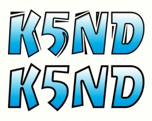
In the original design I used Marker Felt and tweaked on the gradient to best match the cyan coloring of the caricature. After the usual six-month cycle, I started experimenting with other fonts. I even asked the caricature artist, Benjamin Vincent, to sketch my call sign to try that option. The option that I settled on is called Dry Cut. Having said that, I began further modifying the call sign letters in Adobe Photoshop to improve the appearance and better match what I wanted to see on my next version QSL card. You can see the original font nearby at the top and the modified version below.
 I’ve also included an image of the new QSL card with the new font. I really like the clean font, yet the look as though it’s been sketched. It does a better job of matching the caricature style within the expected uniformity of a true font. I’m also really pleased that I figured out, mostly by trial and error, first how to erase the extraneous bits and pieces with the original font, and second, how to tweak the lower curve on the five to generate a smooth image and get rid of the cut line. That’s the part that took some time.
Well, I was so pleased with that work, and now consider this to be the K5ND Dry Cut font, that I decided to generate a new favicon for this website. Hopefully, you can see it in your bookmarks (you have bookmarked this site, haven’t you?) or at the top of your browser window. You can get a better feel for the design by looking at the featured image of this blog post (upper left hand image in the border). I have also used this same image for my Twitter account, which requires a square image.

The favicon has been a fascination of mine for many years, since I first discovered a website using them. This 16×16 image is very challenging to make and have it come out at least partially recognizable. There are a number of favicon generators on the web. I’ve used a few to try to achieve the desired design. Never been really successful with that. Fortunately, my current WordPress theme (from iThemes) will automatically generate the favicon from your uploaded image, and place that image in the correct part of your site. This one works OK. You can mostly recognize what’s trying to be conveyed.
Let me know what you think.


